What is it?
Menu: Woo2App >> Theme
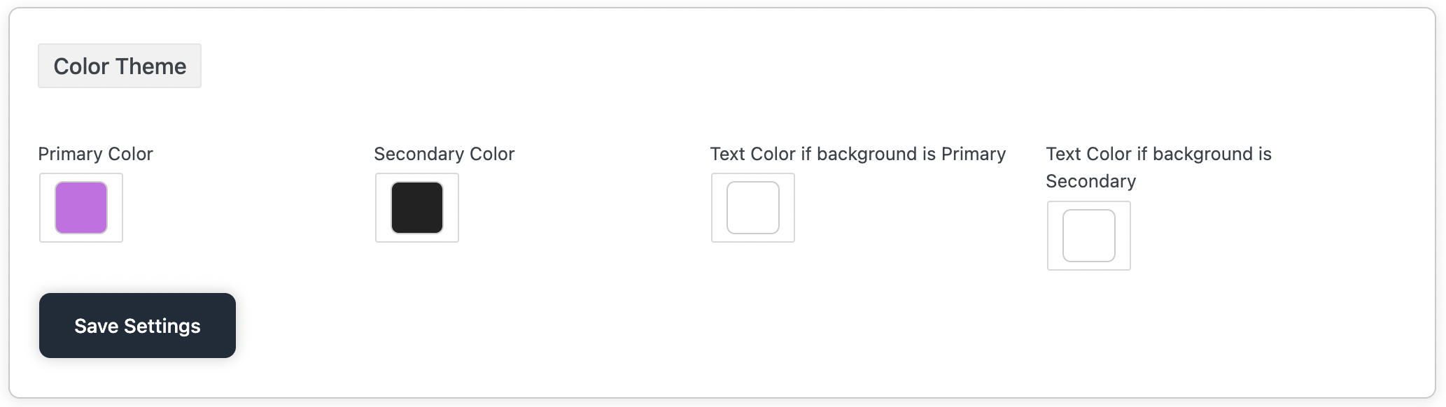
To personalize the look and feel of your mobile app, Woo2App lets you configure a Color Theme with 4 customizable options. These colors will be applied across various parts of your app — including buttons, icons, headers, and text.
Here’s how each color setting works
Primary Color
What it is: The main brand color of your app.
Where it’s used:
- Primary buttons (e.g., “Add to Cart”, “Buy Now”)
- Active tabs
- Highlights
- Headers or AppBar
- Loading indicators
Example: If your brand color is blue, use #007BFF.
Secondary Color
What it is: A supporting color that complements the primary color.
Where it’s used:
- Secondary buttons (e.g., “Cancel”)
- Notification tags
- Category badges
- Borders or minor accents
Example: You might choose a light gray or pastel tone to contrast with the primary.
Text Color if background is Primary
What it is: The color of text that appears on top of the primary color.
Where it’s used:
- Text inside primary buttons
- Titles or labels when the background is the primary color
Tip: If your primary color is dark (like navy), use white #FFFFFF as the text color.
Text Color if background is Secondary
What it is: The color of text that appears on top of the secondary color.
Where it’s used:
- Text inside secondary buttons or tags
- Sub-labels on accent backgrounds
Tip: Match it for best contrast — if secondary is light, use dark text.
Changes will reflect in your app UI after the next app refresh.